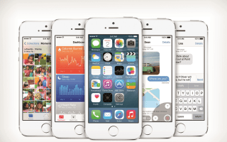
 When it launches this fall, Apple’s iOS 8 will bring a mix of features to iPhones and iPads that match Android in some ways, as well as some that go beyond what Google’s OS. On the catch-up front, there’s predictive typing, widgets (inside Notification Center), more sharing options for content, and the ability to swap out your keyboard for third-party options. Also, iCloud Drive appears to be an attempt to mirror the success of Google Drive.
Among iOS 8's more original innovations are Family Sharing, which enables up to six family members enjoy iTunes, iBooks and App Store purchases. We especially like the Ask to Buy feature, which lets parents approve their children’s purchases from their own devices. The new Health app also has potential, as it will sync with third-party apps and give you a single dashboard of your vital metrics, one that could be shared with your doctor for more expedient care.
However, iOS 8 falls short in some areas. Here are 5 features that are still missing from Apple’s platform — ones we hope that will arrive in subsequent updates.
Parental controls
Apple deserves credit for placing an emphasis on families with Family Sharing. Not only can you share iTunes purchases among multiple family members, iOS 8 will provide a shared family photo stream, a calendar and the ability to locate family members. Unfortunately, it doesn’t seem as though as Apple has beefed up its parental controls.
MORE: 10 Tips Every iPhone Owner Should Know
While you can still restrict certain apps and block content based on age rating, iOS 8 doesn’t let you set time limits for overall device usage. Amazon FreeTime feature for Kindle devices has done this for years, and the company recently added educational goals (such as reading for 30 minutes) to unlock rewards. Meanwhile, Samsung offers a special Kids Mode for its Galaxy S5, which provides a kid-friendly environment with only the apps you approve.
Transit Directions in Maps
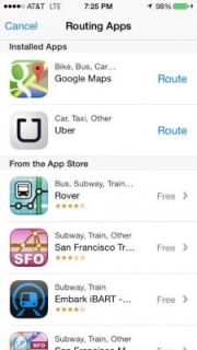
At this point this feature should be a given in iOS, but it’s not. In order to get transit directions in the Apple Maps app, today you need to go through a third party like Google Maps. This takes you to another app, which is far from a seamless experience. Heading up to the launch of iOS 8, some believed that Apple would remedy this issue, but it seems that iPhone and iPad users will have to wait even longer.

Beefed Up Control Center
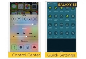
Although iOS 8 makes welcome enhancements to Notification Center by streamlining the interface and adding widgets, it looks like Control Center may be left out in the cold. It’s not that we don’t like the feature; you can adjust everything from volume and brightness and toggle multiple settings just by swiping up from the bottom of the screen. However, unlike the Galaxy S5, you can’t customize your quick settings, nor can you long press on an option (like Wi- Fi) to further tweak your settings.

MORE: 6 Amazing iPhone 6 Concepts
Split-Screen Multitasking
This feature we’d like to chalk up to not being ready in time — or perhaps being tied to specific new hardware. Back in March, 9to5Mac reported that iOS 8 would get split-screen multitasking for the iPad. Now that the WWDC keynote has passed, it looks like you can probably forget about this feature coming to the iPhone, even a bigger screen iPhone 6.

The rumors point to an interface change that would allow iPad users to not only display two apps side by side, but also drag and drop content from one window to another, similar to Samsung’s Multi Window feature. However, Samsung enables this functionality on both its Galaxy phones and its tablets. In fact, you can run up to four apps on the screen at once on the Galaxy Note Pro 12.2. Microsoft also allows you to “snap” up to four apps on the Surface Pro 3.
A More Dynamic, Personal Home Screen
I’m sure a lot of Apple fans will take issue with me calling this a missing feature, but the iconic home screen in iOS looks too darn familiar. Yes, it’s a risk to tinker with a formula that has become so second nature for millions of people. But that doesn’t mean you shouldn’t allow power users to tinker. iOS deserves something more dynamic and personal, even if Apple doesn’t go as far as HTC’s BlinkFeed or Samsung’s My Magazine UX.

If you look at the iOS 8 home screen, you would be hard pressed to tell any substantial differences between this release and iOS 7. The only notable addition is the Health app. To be far, iOS 7′s flat makeover was a pretty big shift, but the home screen shouldn’t stay stagnant forever. How about not confining the widgets to Notification Center, or allowing for variable sizes for app icons, similar to Windows Phone?
Bottom Line
The iOS 8 story is far from over, as there are hundreds of new features that Apple didn’t get a chance to cover during its WWDC unveiling. However, based on what I know at this stage, there are still gaps in the platform that the company should fill. Some of my wish list items may be addressed after launch, and others may have to wait (like split-screen multitasking) for new hardware. But I wouldn’t wait until iOS 9.
(by: Mark Spoonauer
No comments:
Post a Comment