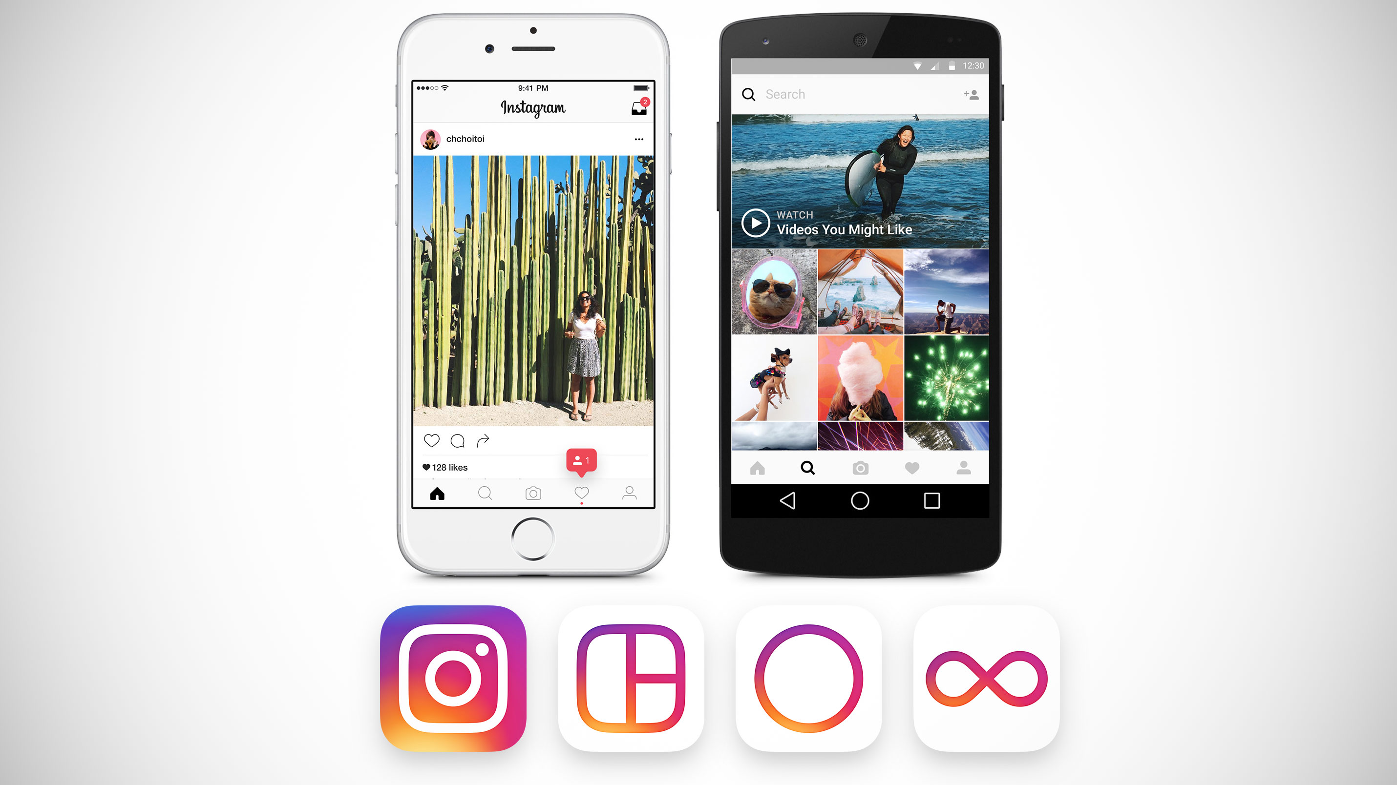
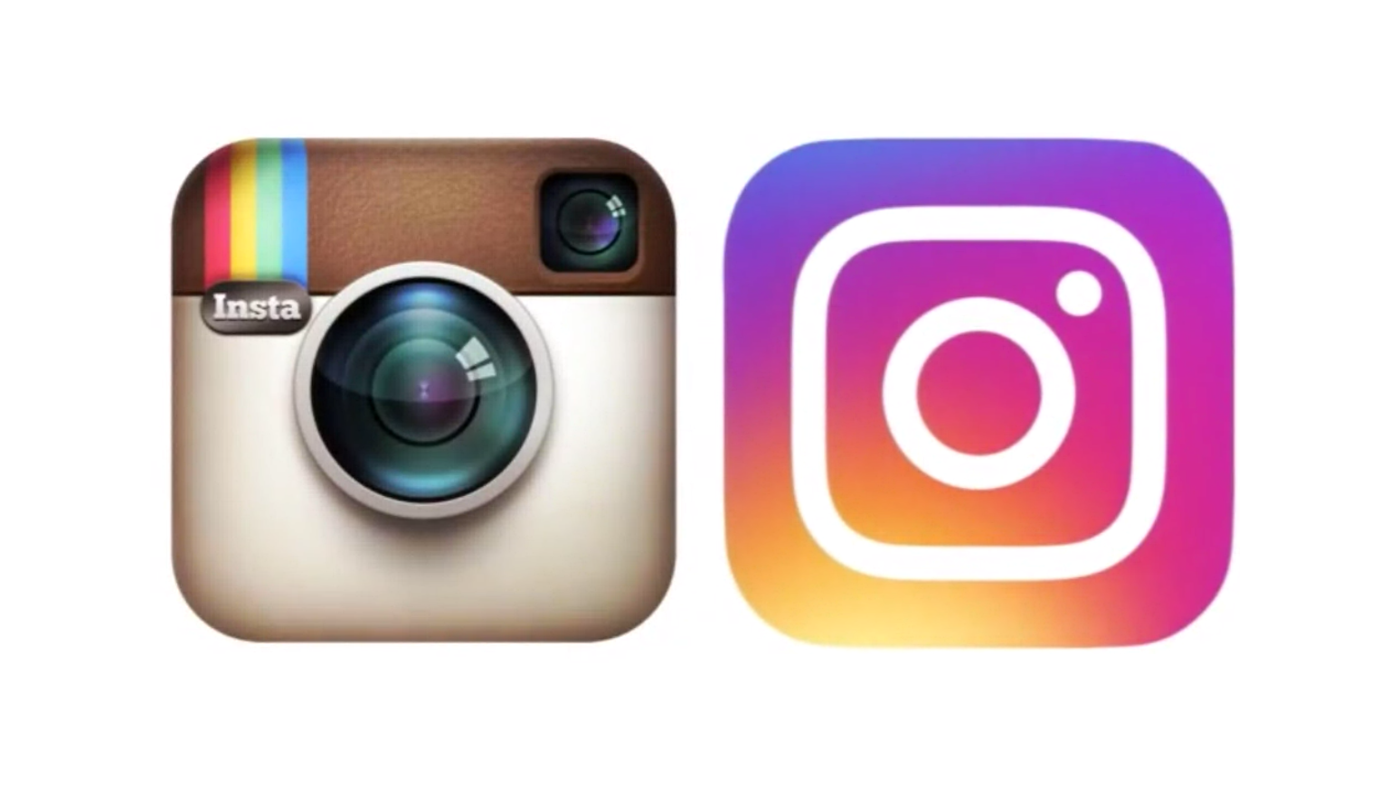
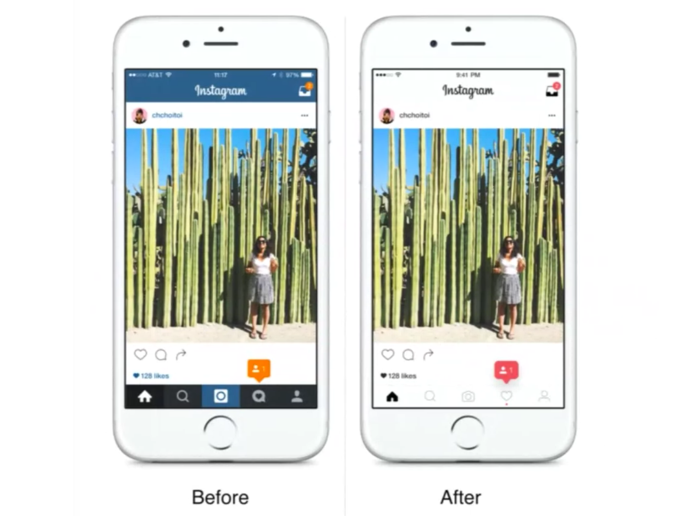
 Instagram’s new icon is pink. Well, it’s pink and purple and yellow and orange. It’s definitely different. And that’s not all the company has changed today. Instagram this morning is rolling out a radical redesign of its mobile application, which not only includes this new, brightly colored app icon but also a revamped user interface that does away with color in favor of a black-and-white look and feel.
You may remember that screenshots of this redesign leaked last month, prompting many to wonder if such a change was actually in the works.
As it turns out, it was.
Instagram’s interest in updating the icon was to better reflect how its community has changed over time.
“When Instagram was founded over five years ago, it was a place for you to easily edit and share photos. Over those five years, things have changed,” says Ian Spalter, Instagram’s Head of Design. “Instagram is now a diverse community of interests where people are sharing more photos and videos than ever before, using new tools like Boomerang and Layout, and connecting in new ways through Explore.”
The new icon, however, still references Instagram’s history with its now simplified and softer camera that appears in the much more colorful design.

In addition, the colors that blend and blur from purple to pink to orange and yellow are also supposed to reference Instagram’s iconic rainbow in its older design. (This isn’t entirely obvious, but we can see how the designer would want to make that connection.)
Meanwhile, where Instagram’s icon is now filled with color, the app itself has had the color removed. Instead of using blue and white in the app’s chrome, the new black-and-white design allows the color in the app to come from the community and what’s being shared. The user interface is no longer competing for attention.

Though this design change will impact users the most, given it’s the app that’s actually interacted with on a regular basis, it somehow feels less jarring – at least, initially – than the change to the app icon.
Perhaps that’s because nothing has been fundamentally changed with regard to the app’s workflow. The buttons remain in the same positions, and pops of color are still shown to highlight things like notifications, for example. And there are some slight under-the-hood changes. For instance, Instagram now uses standard iOS and Android components, fonts and patterns. But the app itself is simply a cleaner, more modern version of the Instagram we know and love.
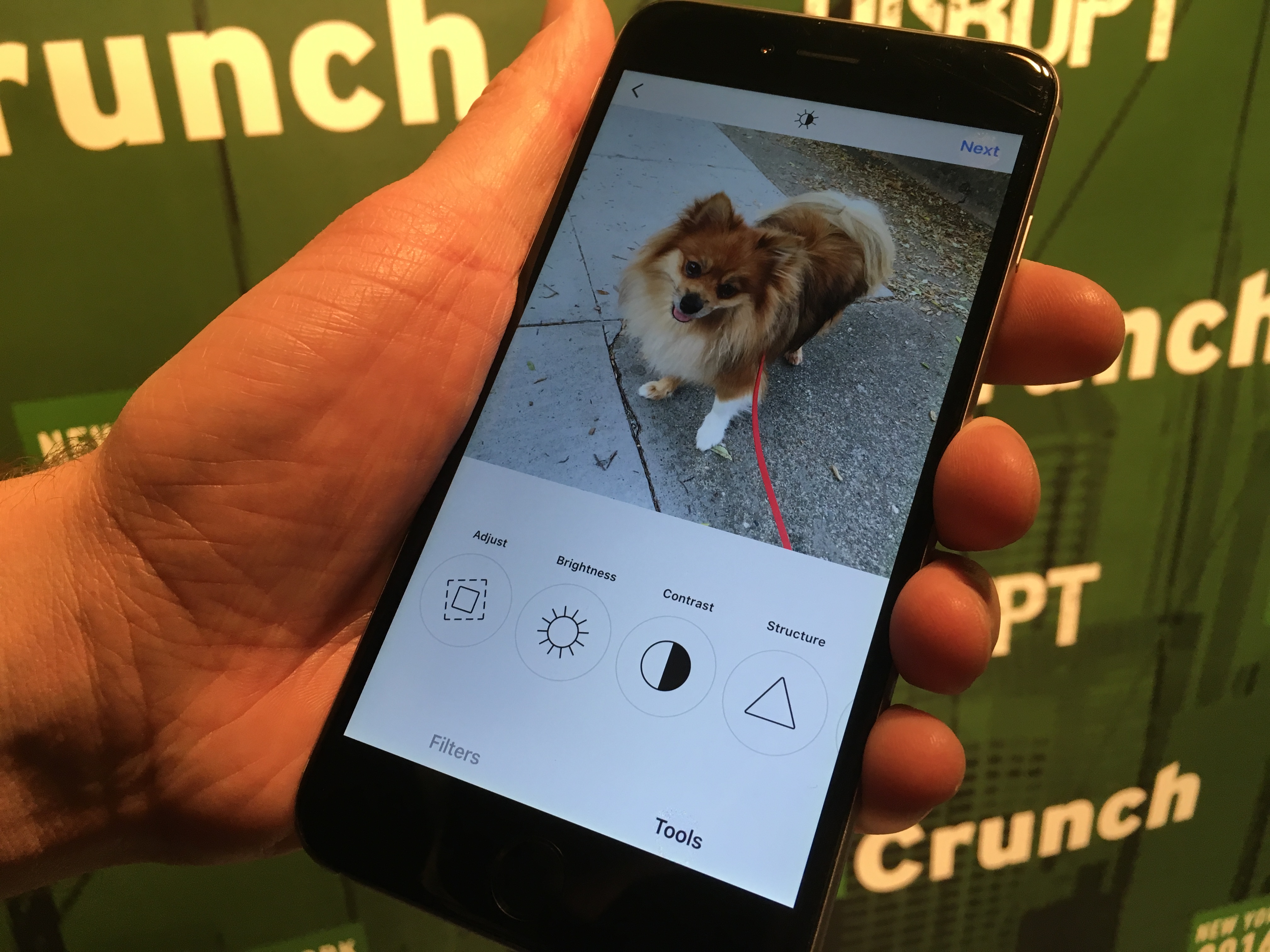
That’s not to say it doesn’t take some getting used to. Seeing the editing tools laid out in black-and-white simplicity will prompt a double take the first few times you use them. But the process of using the tools has not been changed.

However, the icon’s update feels as dramatic as iOS 7 once did when Apple’s Jony Ive unveiled the operating system’s newer, flatter look-and-feel and its brighter color gradients. This initially prompted some user backlash among Apple fans who had trouble adjusting. (Remember the Jony Ive Redesigns Things Tumblr, anyone?)
What’s funny is that the iOS revamp years ago eventually prompted Instagram’s user base to call for the company to update its look as well. The older app icon began to feel out of place on the iPhone home screen, as other app icons were updated to better fit Apple’s new design language.
Then, when Google rolled out its own take on flat design with Material Design, Instagram’s icon began to feel a little out of place there, too.
![]()
Besides the icon change and black-and-white revamp, Instagram’s larger suite of apps, including Layout, Hyperlapse and Boomerang, have also received new icons. These new icons now better reflect what their app does in some cases. For example, the collage maker Layout has gone from a square to a grid. They also now match the new Instagram icon’s color scheme.
While the makeover is dramatic, it’s not tied to the other forthcoming changes, like the rollout of Business Profiles due in a few months.
Instagram has been working on this redesign since last summer and ended up testing over 300 icons before arriving on a lead candidate in late November. The company then worked on the user interface update, which had been tested internally since the beginning of the year.
Those tests finally made it out into the wild in the past couple of weeks, which is when users spotted them and the news of the redesign was leaked. The company doesn’t share details on its internal tests or how the changes impacted key metrics like user engagement.
However, with 400 million users worldwide who share more than 80 million photos and videos daily, it’s not likely that the company would roll out an update of this magnitude if it were worried the changes could negatively impact any of its numbers.
(Read More at : techcrunch.com)
No comments:
Post a Comment